Avanti Mob
UX | UI Design
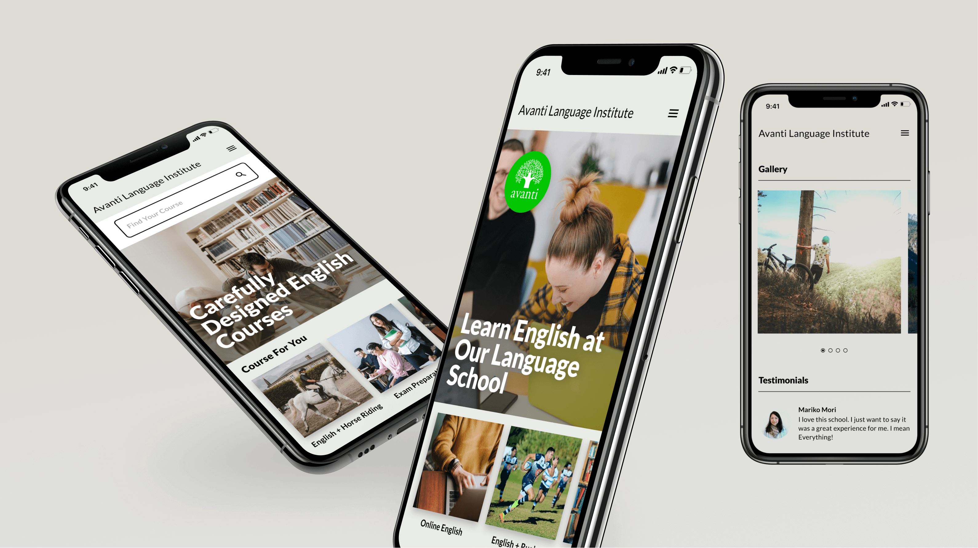
Proposal for mobile version of client’s website.
Problem summary
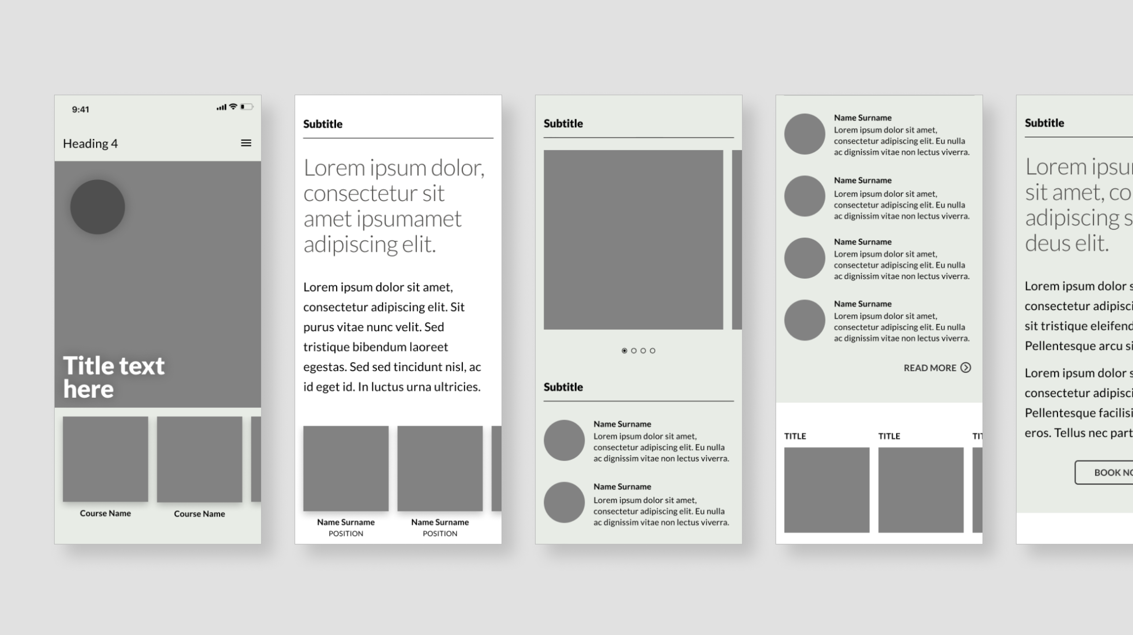
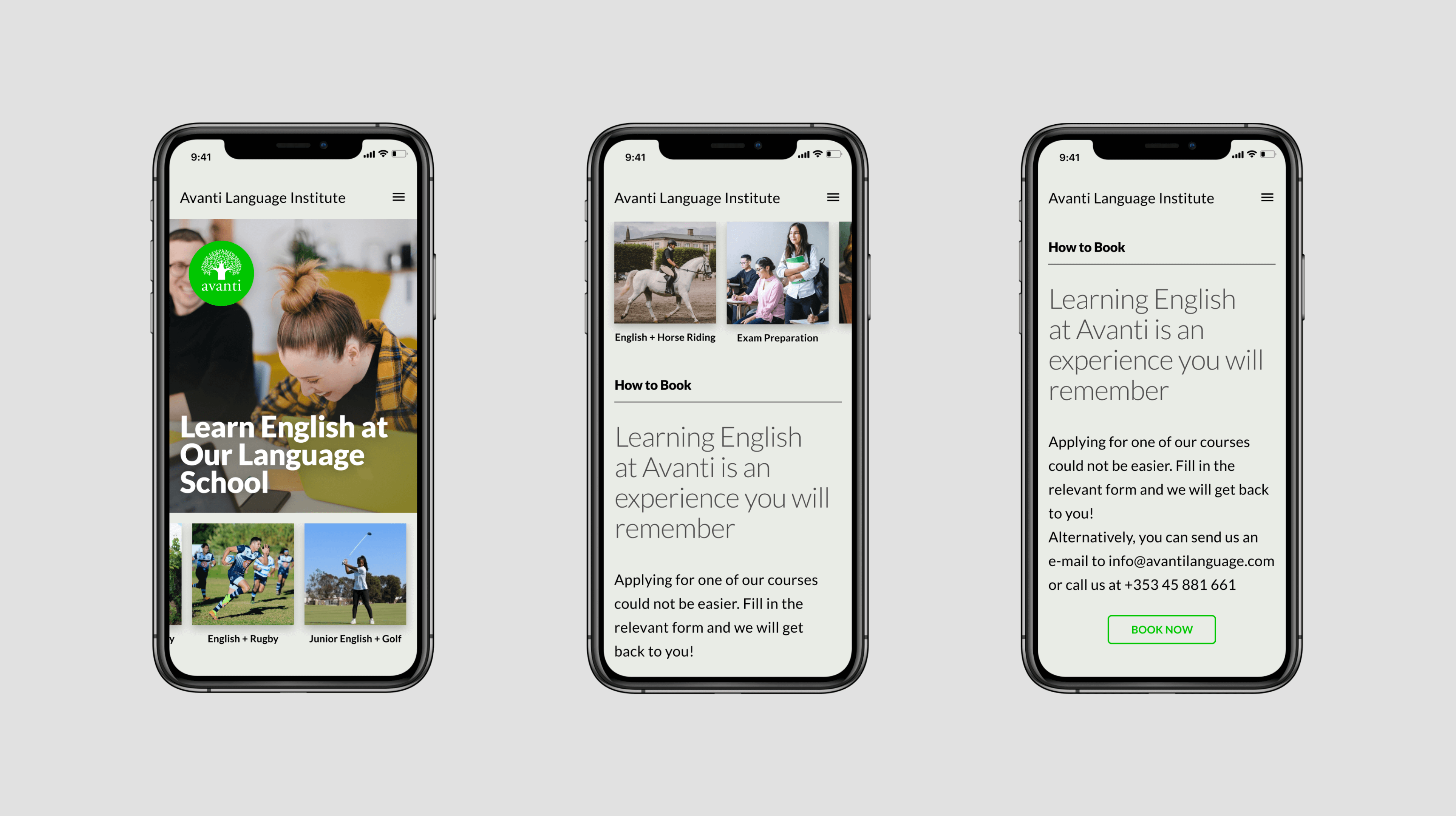
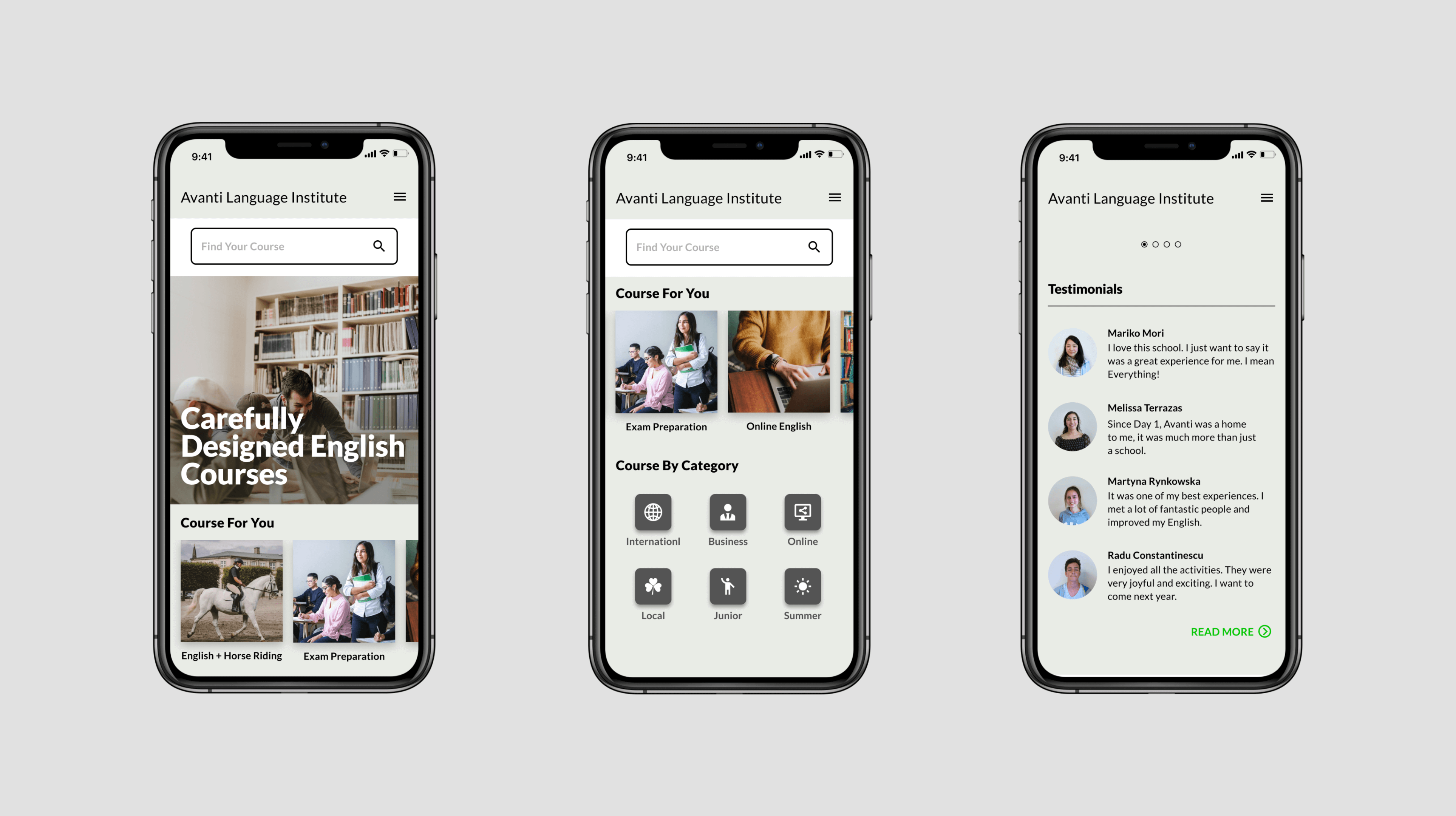
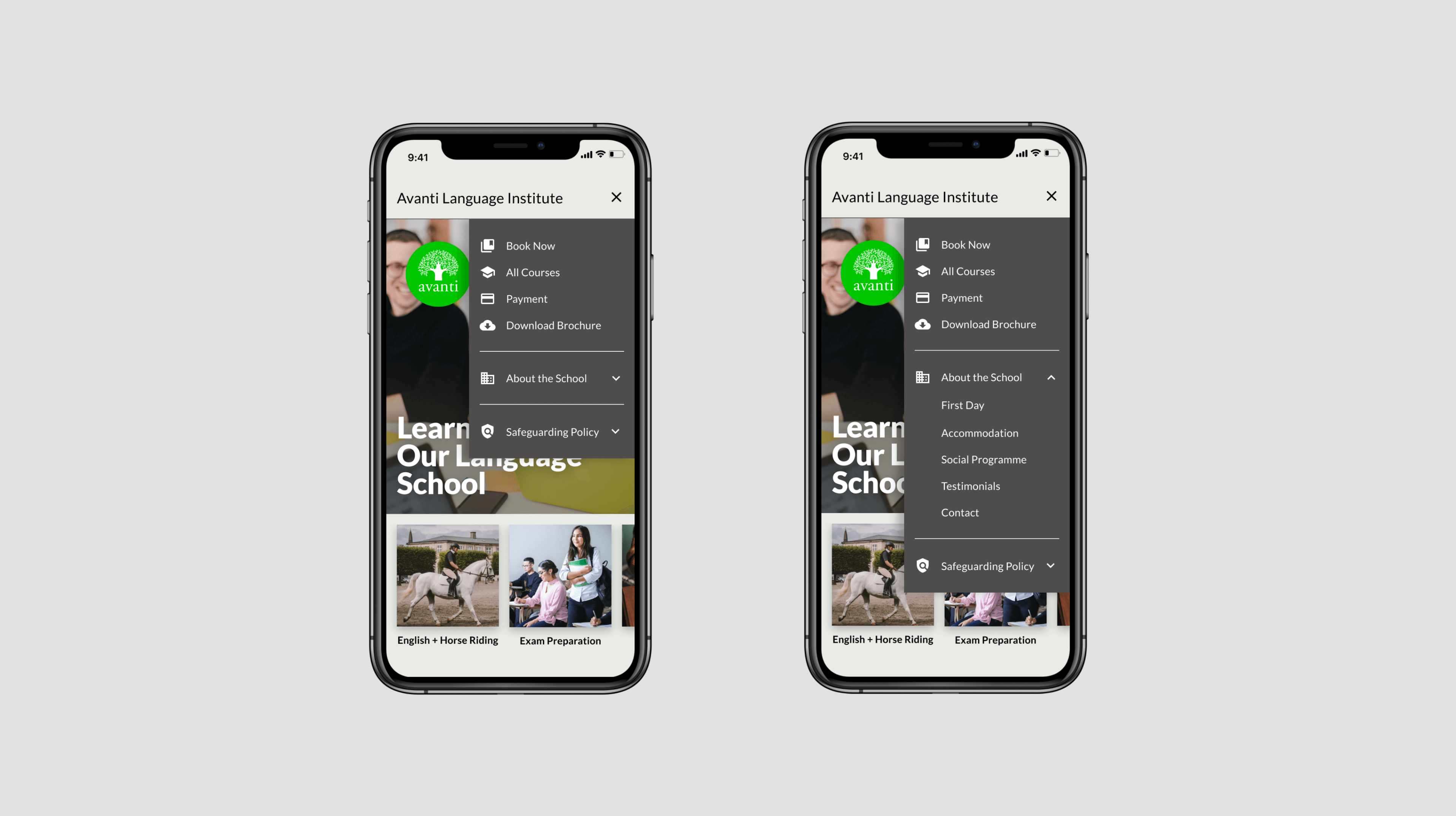
1. Site menu
The user needs easily to navigate among website’s main sections, but space to show such navigation is limited.
Solution:
-
develop content hierarchy and semantically categorise it for better experience;
-
enable vertical accordion menu that unfolds when a user is looking for additional info from a specific category;
-
use icons next to sections in menu that grab a user’s attention and aid navigation.
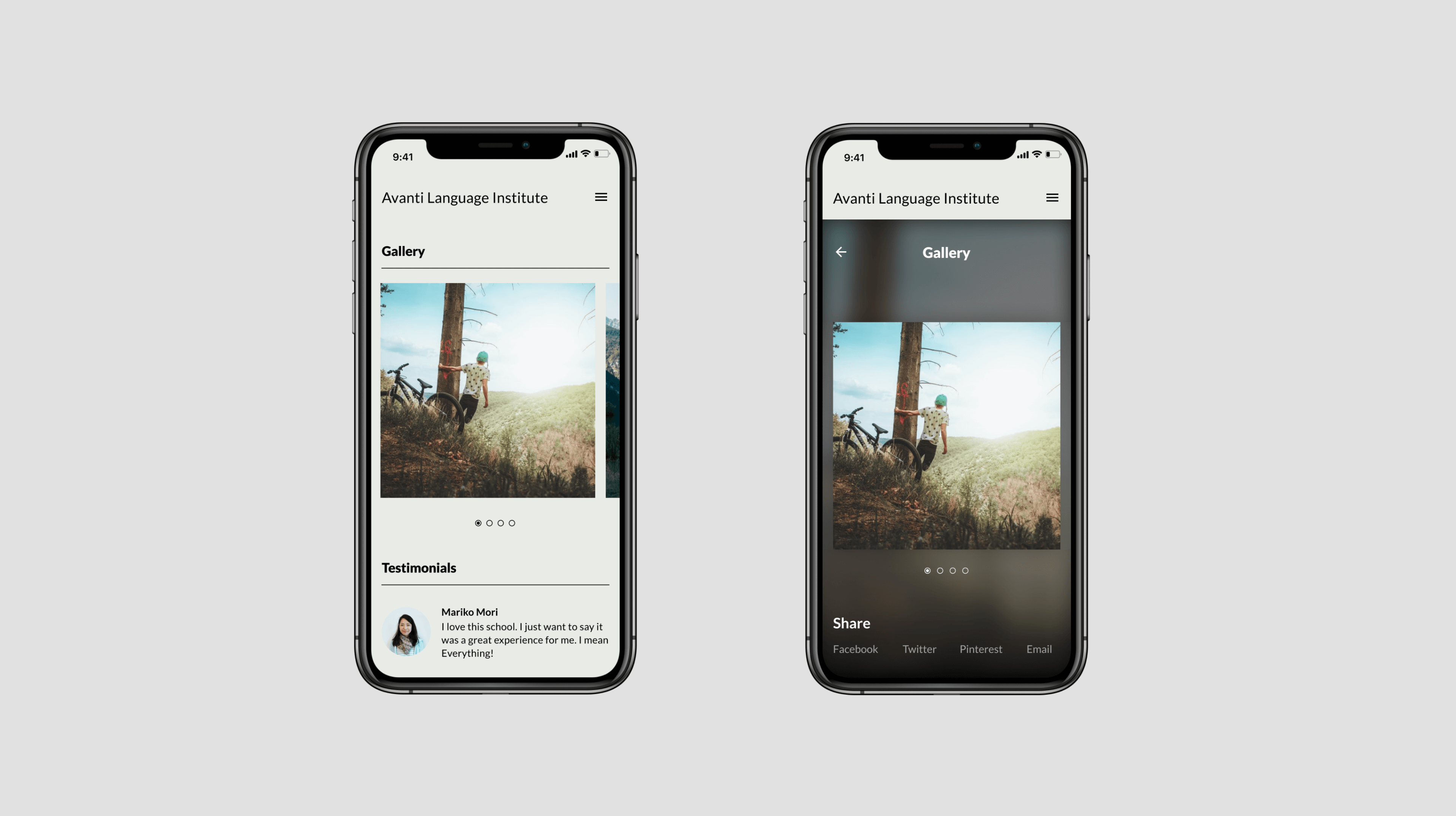
2. Visual content vs Textual
Help users navigate among what the school offers and do not overwhelm them dozen of information.
Solution:
Researchers have found that people process visual content much more efficiently than they process boring text links.
-
use of carousel is a perfect fit for highly visual content such as language courses;
-
optimise screen space by displaying only a batch of images from all collection in a cyclic view;
-
tease the user by letting him or her know that there are more courses available.