UI Case Study: Slack Landing Page

UI Design | Prototyping

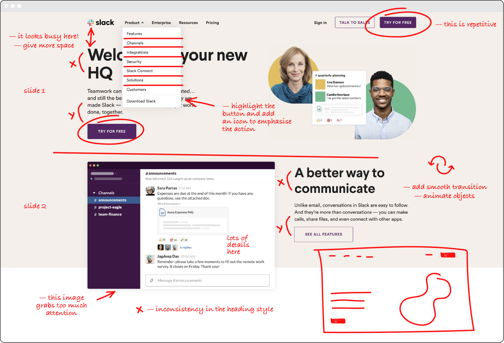
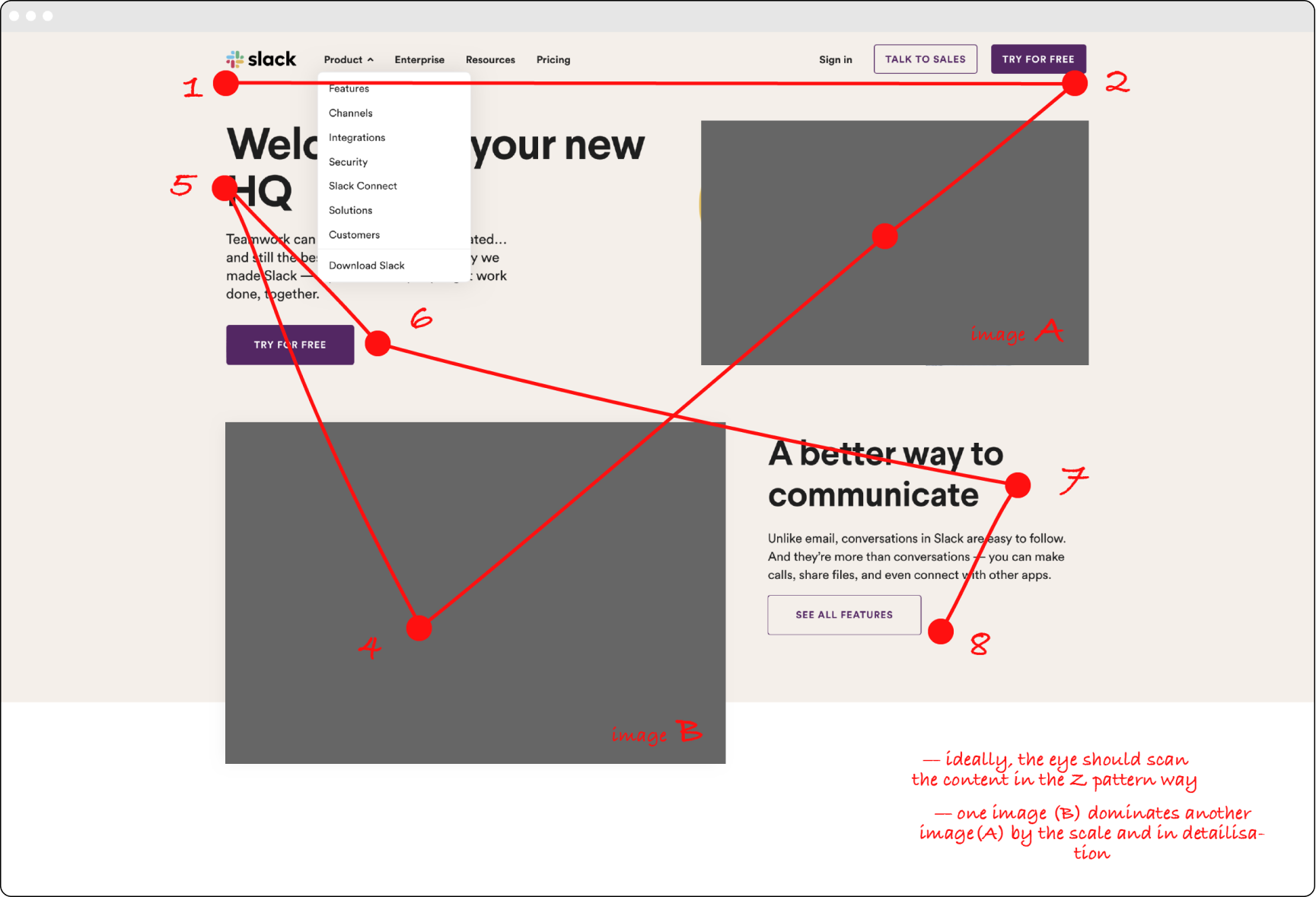
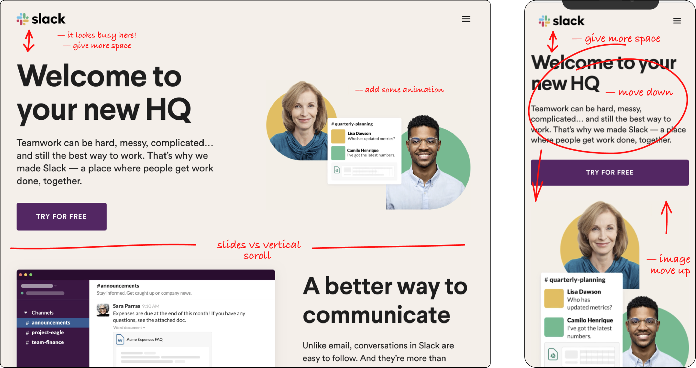
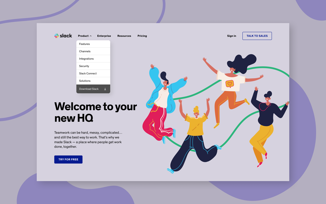
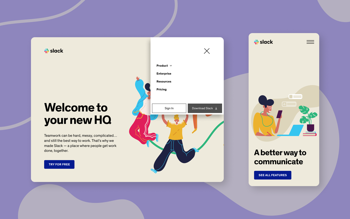
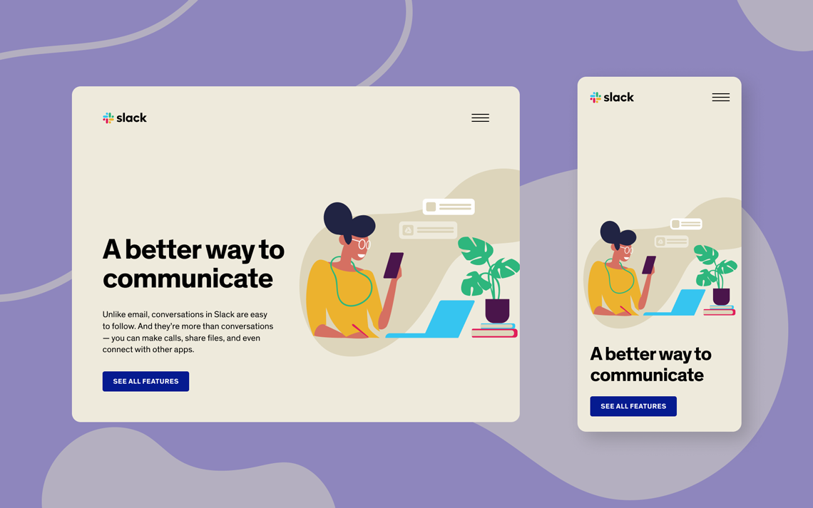
We use UI design to communicate our important messages and to avoid visual or logical obstacles in this way. A landing page is the start of users’ journey on every website. The way how you build a visual hierarchy will affect what will stay in users’ mind and what actions will be taken.

In an ideal world, every element in our design should help improve our user’s experience and more clearly convey that message.

I’ve used the Slack landing page as I really like their brand and the product they have created. The website is well-made from a user point of view but I would like to introduce some suggestions as a designer. First of all, Slack’s website is a great example of a site that uses typeface and its weights to give content an order of importance. In the banner section, they have the largest header with a description below and some calls to action that make this area feel the most important.


Nevertheless, I made some observations and marks of the landing page in 3 different window sizes; desktop, tablet and mobile screens. (see images below)


— the layout of two banner sections (one above another) with images, calls to action and descriptions on a side looks overloaded and visually difficult to digest;

— add more space between the top navigation and a banner to pull focus and separate UI elements. It will help to direct the user attention to important parts;


— Designing the content to flow with the Z pattern will help users scan through each UI element more efficiently and see where are the important parts of your message.


Solution


The current layout of the site just needs some “tickles” which in my opinion will only improve overall user experience. I would consider giving more negative space between UI elements.

In particular, I would recommend to increase the distance between the top menu bar and a banner with a text block on aside and simplify some heavily detailed illustrations such as app screenshot. 


Rational


— if we count the speed of perception and how it impacts on UI, simplified illustration can be perceived faster as it provides an overall impression of the process rather than describes it in small details. Also, If the message they transfer is not clear or can be double-read, the speed will not bring positive user experience. Recognition means not only speed but also the right action or information which the visual element should bring to the user.

— smooth animated transition between states will make the UI look well-crafted. As psychologists claim, people need about 1/10 of a second to get a general perception of a visual scene or element;

— by giving existing UI elements more space we achieve a better visual hierarchy in the layout. Negative space creates contrast by proximity/distance between objects.

Illustrations by pch.vector & pikisuperstar | Freepik